Rebranding a Berlin local field hockey club to show their professionalism and youthful spirit
Rebranding a Berlin local field hockey
club to show their professionalism
and youthful spirit
This project was developed as part of our design studies at SRH Berlin School of Design and Communication and focused on reimagining the visual identity of a local field hockey club on the outskirts of Berlin. Working as a team of four students, we created a fresh and engaging brand identity that reflects the club’s youthful community of children and teenagers. Through interviews, design thinking methods, and collaborative ideation, we developed a dynamic and contemporary corporate design system.
This project was developed as part of our design studies at SRH Berlin School of Design and Communication and focused on reimagining the visual identity of a local field hockey club on the outskirts of Berlin. Working as a team of four students, we created a fresh and engaging brand identity that reflects the club’s youthful community of children and teenagers. Through interviews, design thinking methods, and collaborative ideation, we developed a dynamic and contemporary corporate design system.
The project began with a briefing to create a more cohesive and professional brand identity for the Tusli field hockey club. Although the club already had a logo and website, its visual communication no longer reflected its ambitions, values, or standing within the German field hockey community.
The first phase focused on research and discovery. Through site visits and interviews with players, parents, and club representatives, we gained insights into the club’s culture and long-term goals. These findings formed the foundation for a strategic repositioning and the development of a contemporary visual identity that better reflects the club’s growth and ambitions.

The original logo of the TusLi field hockey club
The process
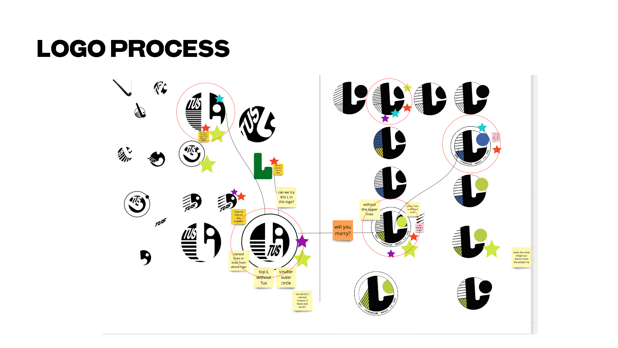
Following the research phase, our team of four moved into concept development and visual exploration. Using the insights gathered from interviews and workshops, we translated the club’s values, ambitions, and community spirit into a new visual direction. Through iterative ideation, sketching, and design thinking methods, multiple concepts were explored and refined.
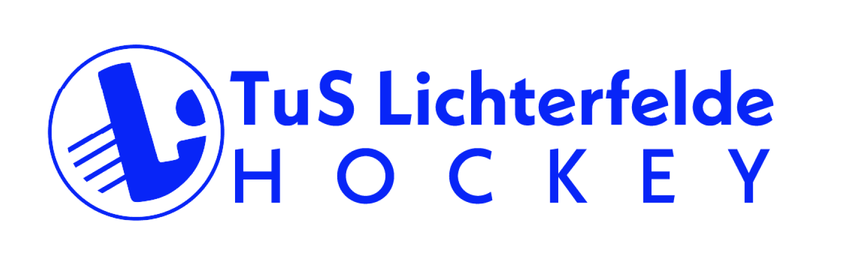
The outcome was the creation of a contemporary logo and a distinctive colour palette designed to strengthen the club’s visual identity across all touchpoints. The new branding system balances professionalism with an energetic and approachable character, reflecting both the club’s competitive ambitions and its strong focus on youth development and community engagement.
Following the research phase, our team of four moved into concept development and visual exploration. Using the insights gathered from interviews and workshops, we translated the club’s values, ambitions, and community spirit into a new visual direction. Through iterative ideation, sketching, and design thinking methods, multiple concepts were explored and refined.
The outcome was the creation of a contemporary logo and a distinctive colour palette designed to strengthen the club’s visual identity across all touchpoints. The new branding system balances professionalism with an energetic and approachable character, reflecting both the club’s competitive ambitions and its strong focus on youth development and community engagement.
The logo and the new colour palette
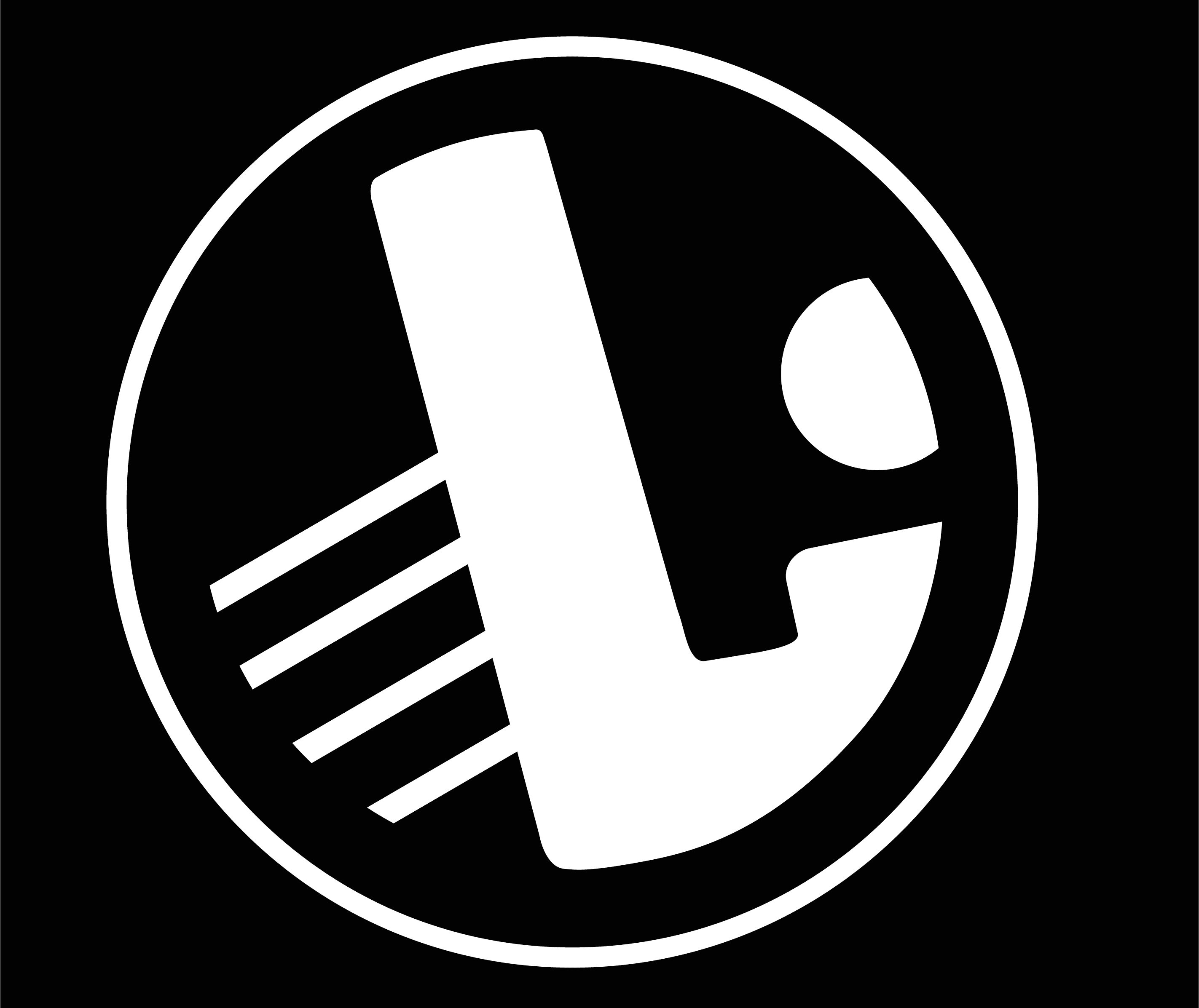
A key requirement of the redesign was to preserve the letter “L” within the logo, referencing the club’s strong connection to the Lichterfelde district. Building on this foundation, the visual concept explored the formal relationship between the shape of the letterform and the silhouette of a field hockey stick.
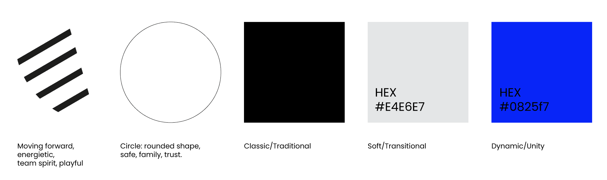
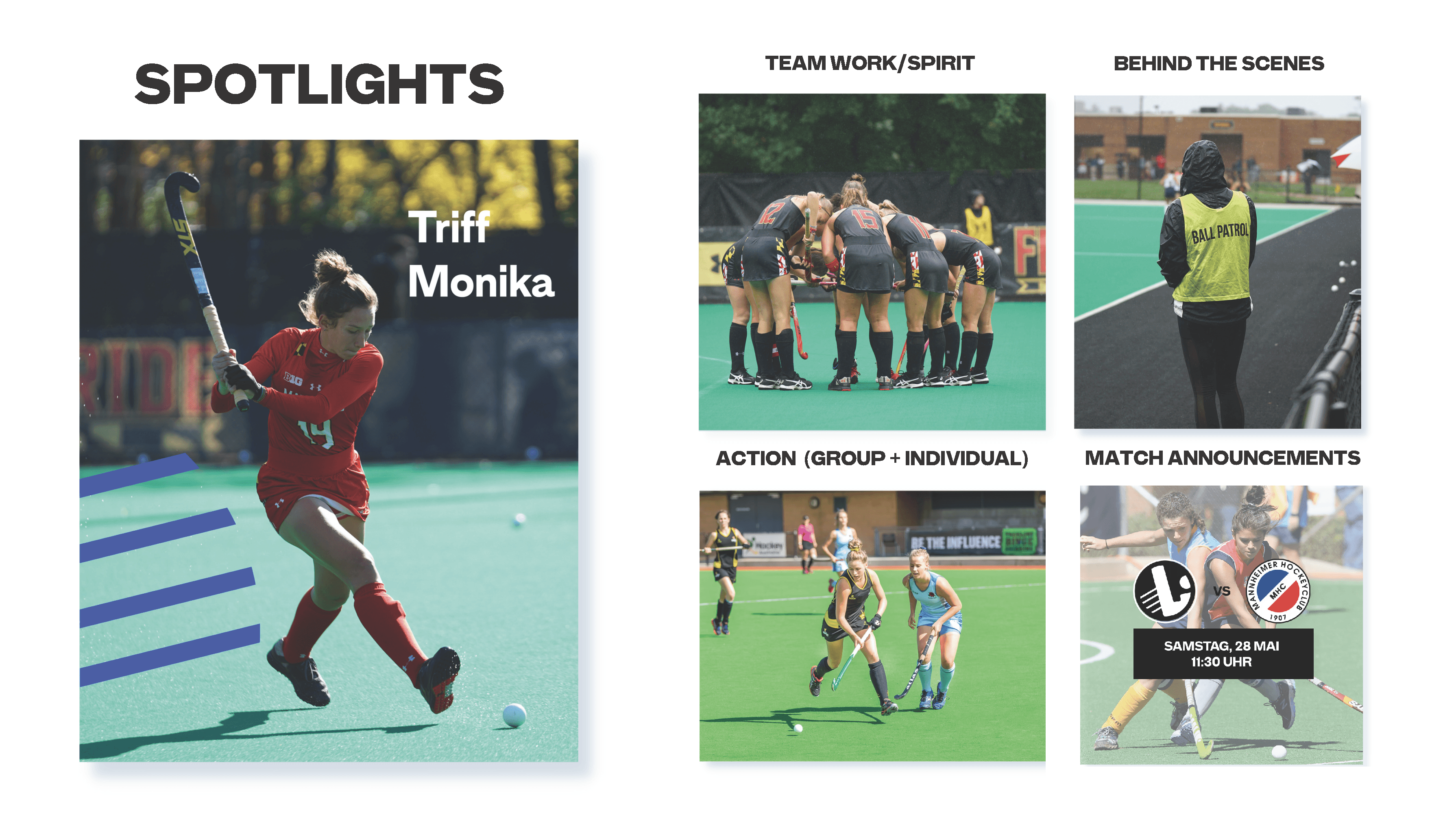
Additional graphic elements were introduced to reinforce the identity of the sport and the club’s dynamic character. A circular form references the hockey ball, while the linear accents extending from the “L” convey movement, speed, and the energetic nature of the game.
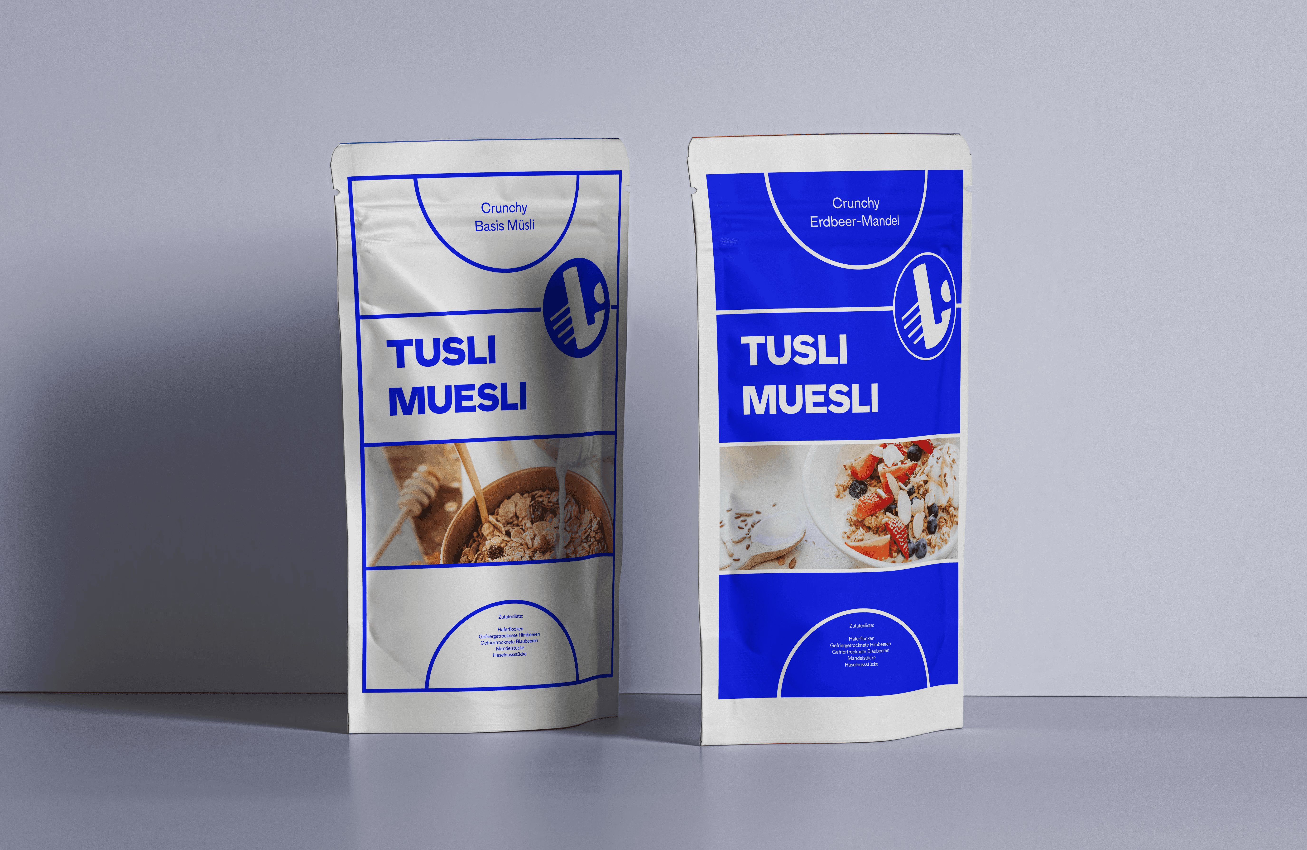
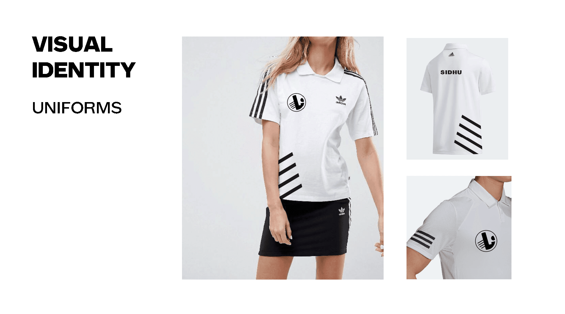
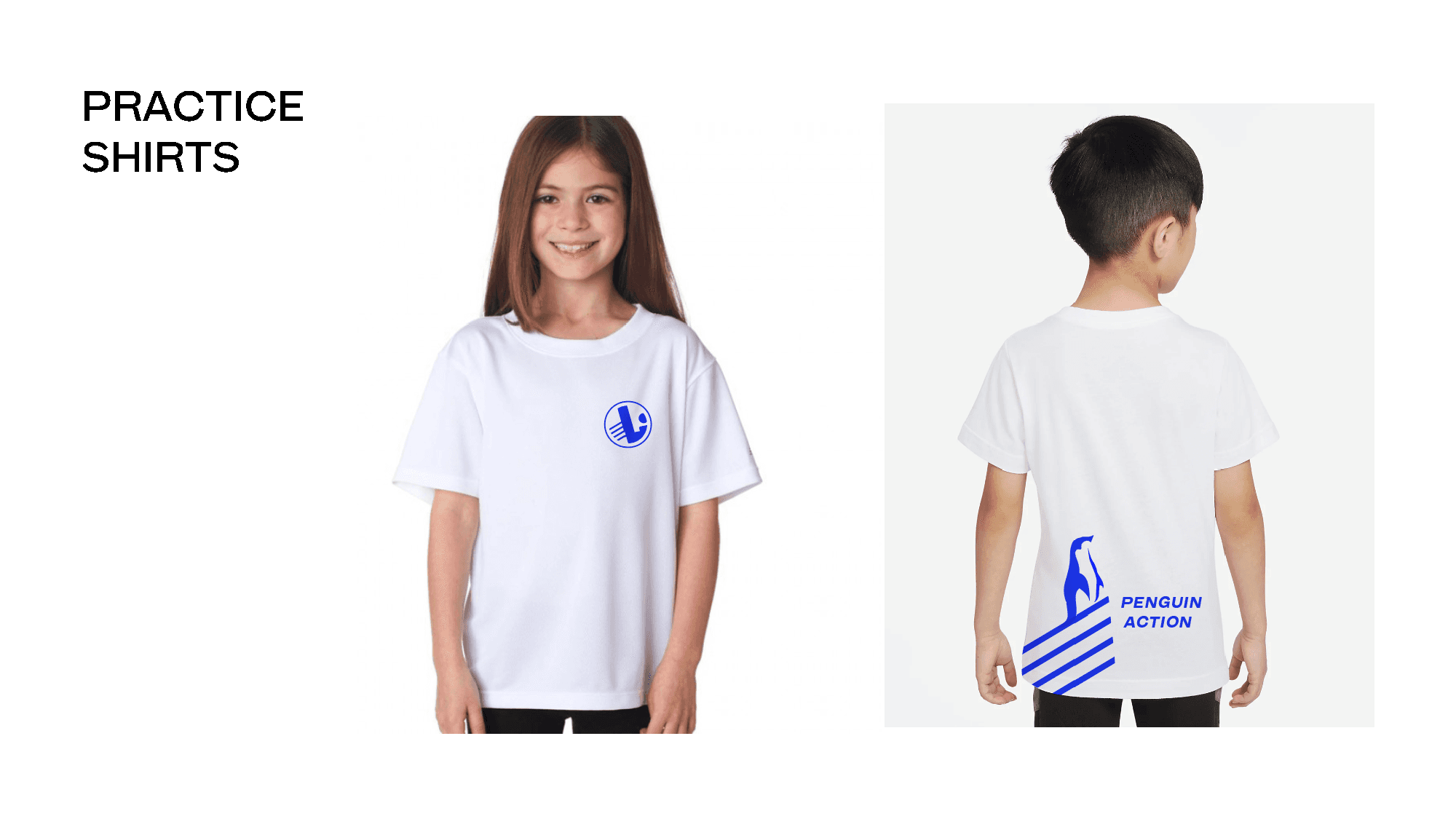
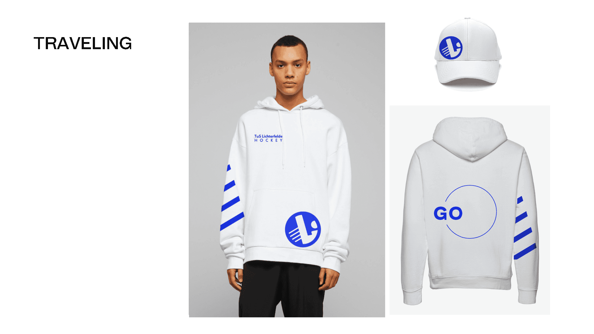
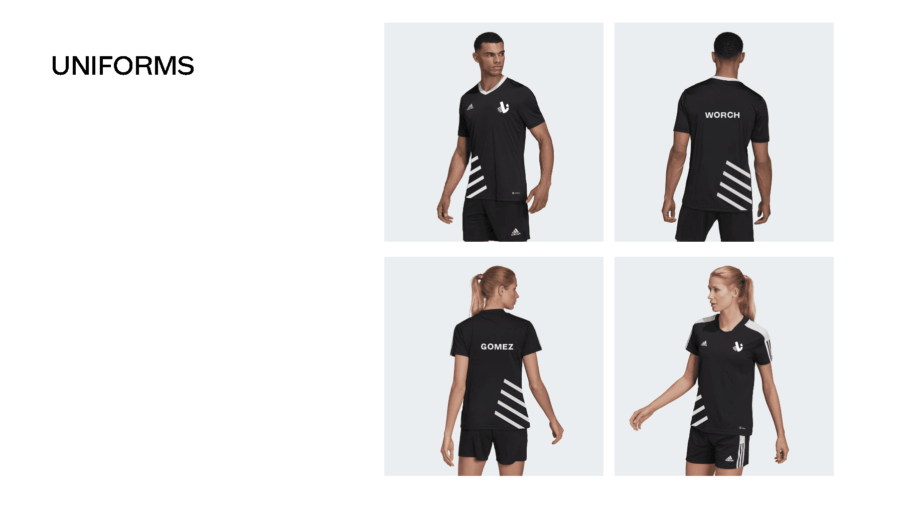
The developed colour palette centres around a vibrant electric blue, chosen to reflect the club’s youthful energy, ambition, and contemporary character. To create balance and versatility across applications, the primary colour was complemented by a neutral palette of grey, white, and black. To further enhance the visual identity, dynamic diagonal graphic elements were introduced throughout the system. These angled forms reinforce a sense of movement, energy, and progression, supporting the club’s active and forward-looking brand presence.
A key requirement of the redesign was to preserve the letter “L” within the logo, referencing the club’s strong connection to the Lichterfelde district. Building on this foundation, the visual concept explored the formal relationship between the shape of the letterform and the silhouette of a field hockey stick.
Additional graphic elements were introduced to reinforce the identity of the sport and the club’s dynamic character. A circular form references the hockey ball, while the linear accents extending from the “L” convey movement, speed, and the energetic nature of the game.
The developed colour palette centres around a vibrant electric blue, chosen to reflect the club’s youthful energy, ambition, and contemporary character. To create balance and versatility across applications, the primary colour was complemented by a neutral palette of grey, white, and black. To further enhance the visual identity, dynamic diagonal graphic elements were introduced throughout the system. These angled forms reinforce a sense of movement, energy, and progression, supporting the club’s active and forward-looking brand presence.