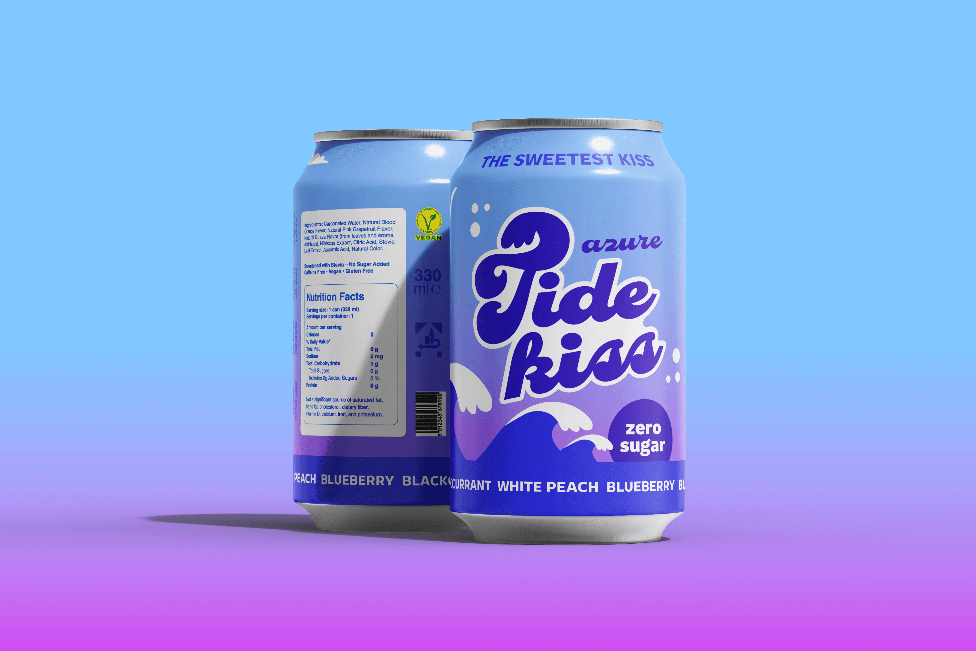
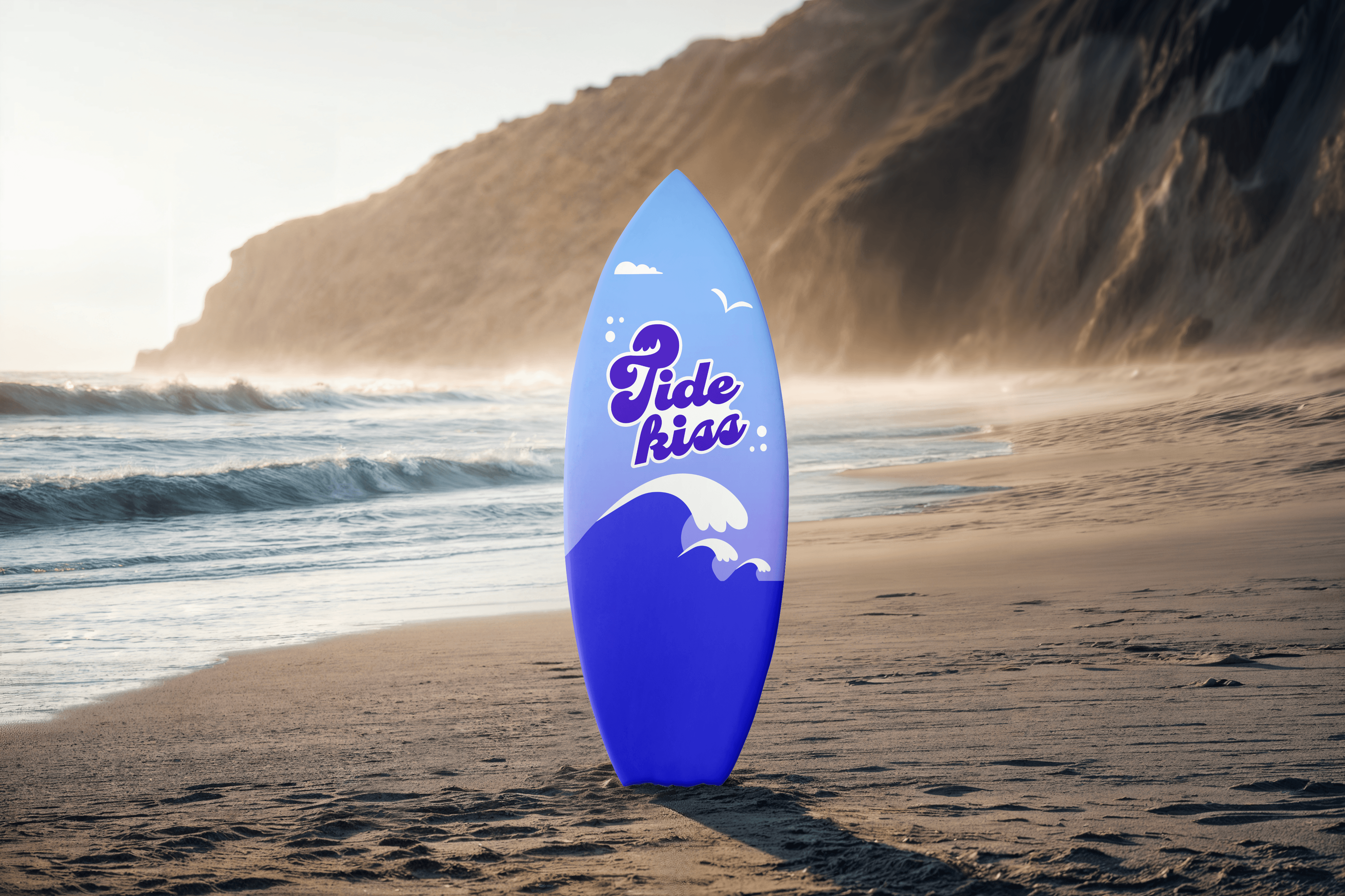
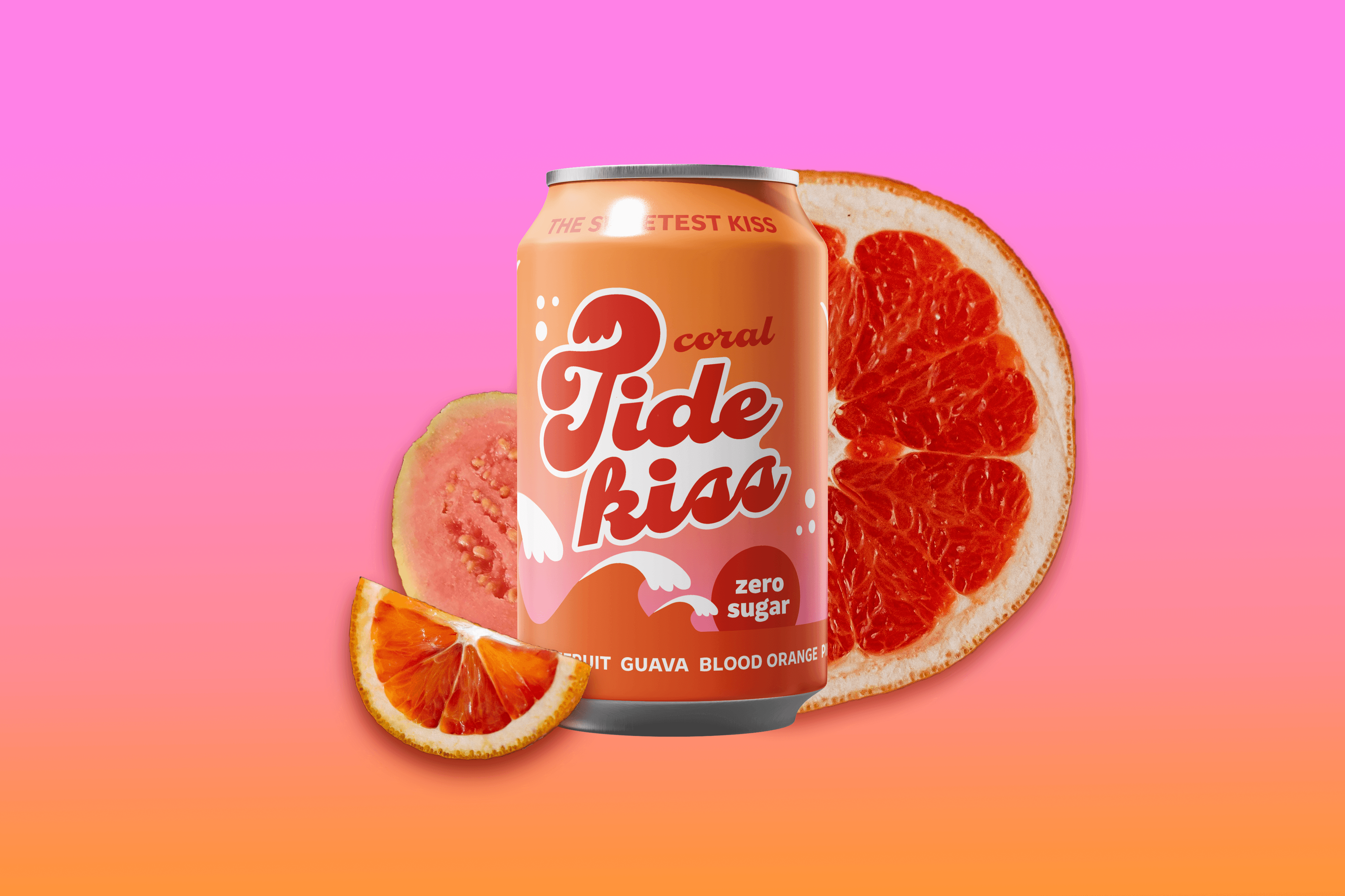
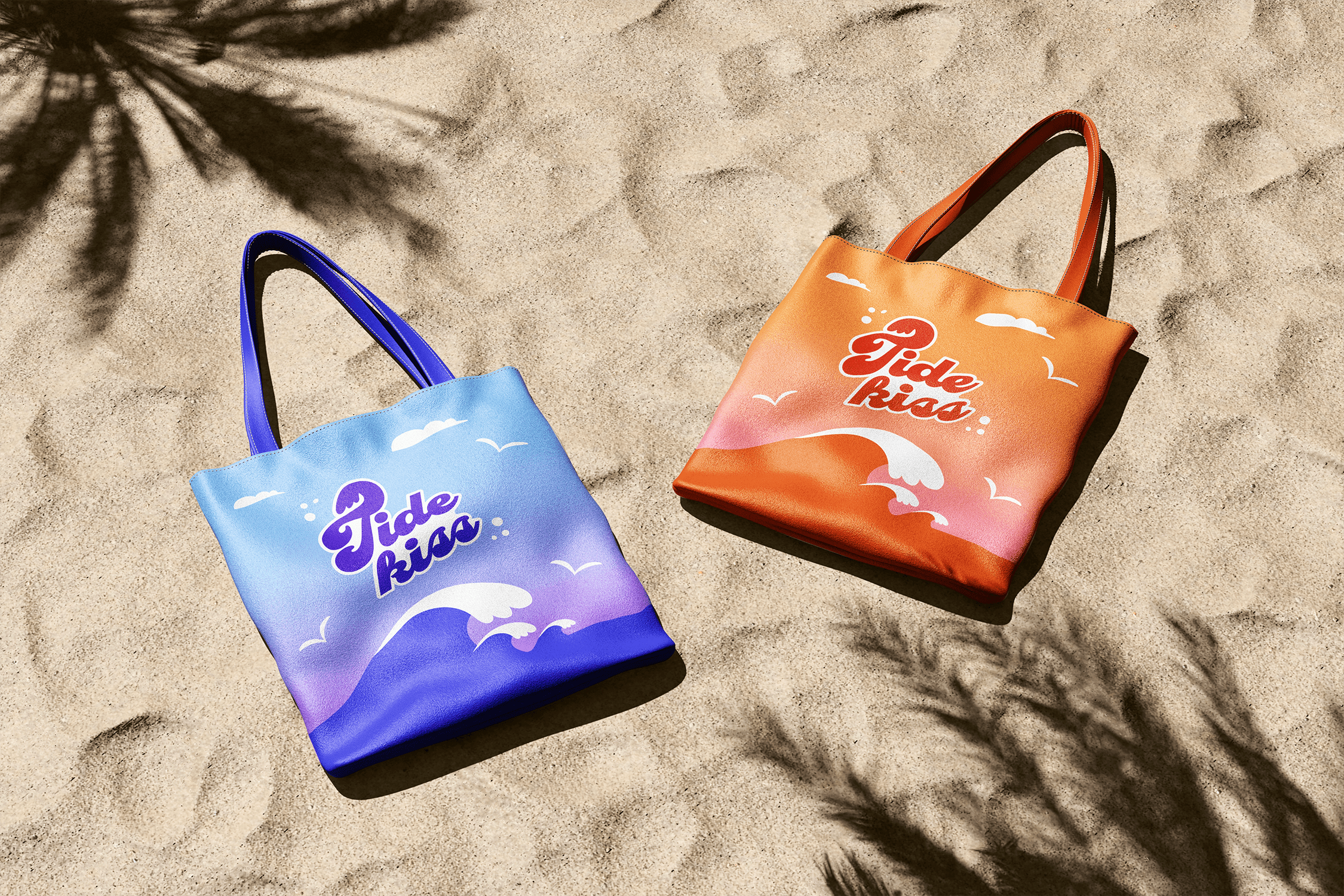
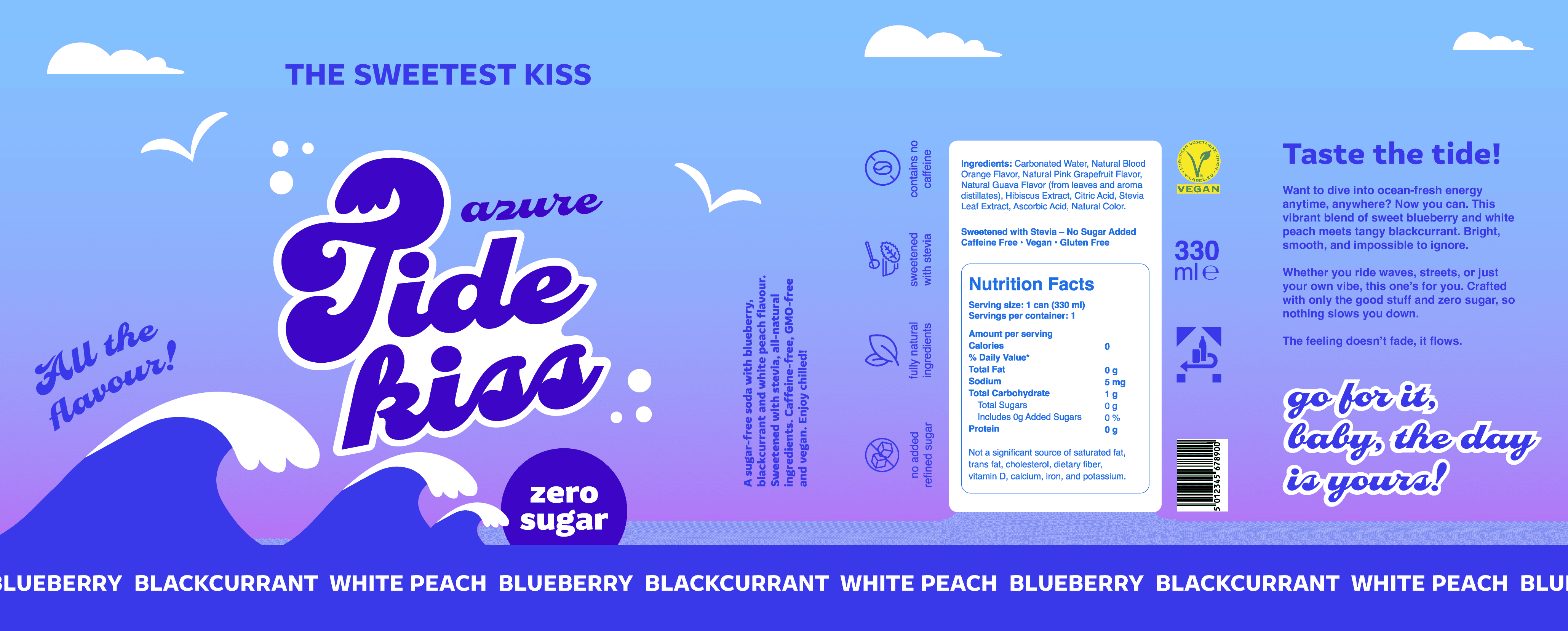
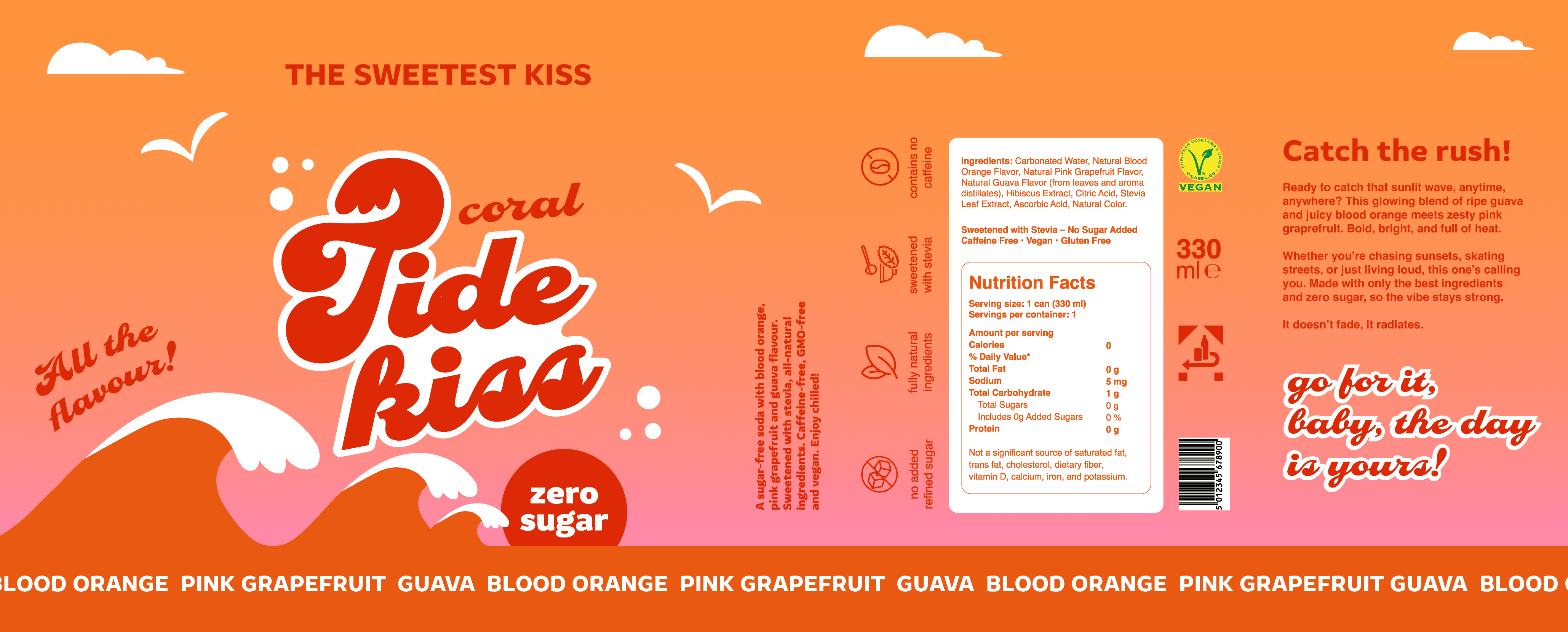
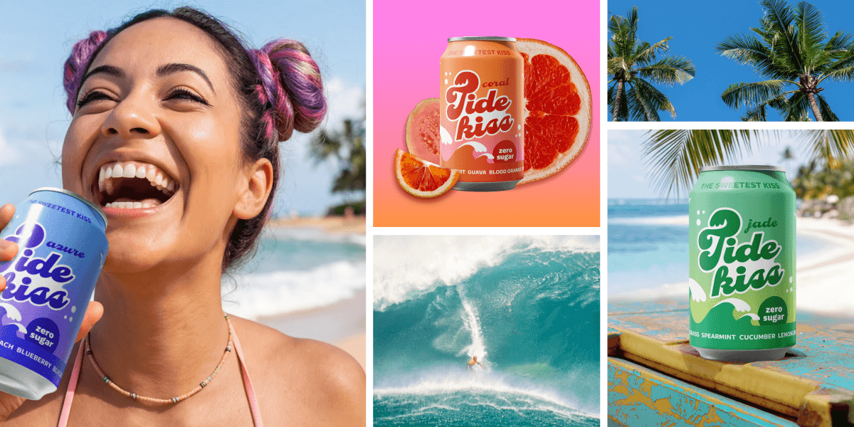
What?
A conceptual brand identity for a sugar-free soda line, built around three flavour variants and a cohesive packaging system.
Why?
The project was an exploration of packaging design with a focus on building a brand from scratch. The aim was to develop a visual system that balances expressive flavour differentiation with overall brand coherence.
Who?
Primarily aimed at a younger audience (Gen Z to younger millennials), while remaining accessible to a broader,
design-conscious consumer group.
When?
2026.

Approach
The project started with a visual analysis of contemporary beverage branding, focusing on how newer soda brands balance bold, expressive aesthetics with clear product communication. I was particularly interested in how colour, typography, and graphic elements are used to signal flavour while still maintaining a recognisable brand system.
From this, I defined an initial direction: a playful, high-energy identity with strong flavour individuality and a clear connection to coastal and refreshment-related imagery.
The following were key elements in my design approach: A shared visual structure across all variants, colour as the main differentiator between flavours and a recurring wave motif to anchor the identity
This allowed the brand to feel expressive and varied, while remaining cohesive as a single product line.
The color palettes refer back to the flavours but also the individual name of the soda. So the flavour azure is blue and purple, coral is pink and orange and seafoam is green and light blue.

Logo development
The wordmark was designed to convey movement and fluidity. For that, I chose the typeface Casey (Ultra) which already has very rounded shapes. Arranging the words in a slanted upward line helped to create a more dynamic impression. I introduced a wave element within the letterform and also adjusted the kerning and some sharp edges within the letterform. This intervention created a stronger sense of motion and gave the mark a more distinctive character.

The logo in its final form. The letter T is a bit larger than the others, featuring a wave element on the right upper side. This wave element is central to the design and also repeats in the design layout. The sort name is added on the right side of the logo, with the same typeface in lowercase letters. Some cheeky bubbles give the logo a more easygoing vibe and refer back to the sea and coastal thematic.
Layout design
The central element to the layout design was a wave element, which is also present in the logo. Three waves are set against a gradient background, with a rising or setting sun, that carries the central message "zero sugar." A couple of clouds and seagulls complete the seascape.
The final packaging is based on a consistent layout applied across all three flavours. This structure ensures clarity at shelf level while allowing each variant to retain its own identity.
The result is a scalable packaging system that balances variation and consistency. The project demonstrates an ability to move from exploratory design to a resolved visual identity, with a focus on hierarchy, coherence, and brand clarity.


